Let me start by saying: I did not have it all figured out when I built my first website.
I was excited, motivated, and totally winging it.
I chose a web host based on a Google ad, I crammed way too much onto my homepage, and I spent more time picking fonts than thinking about the user experience. It still technically worked—but looking back, I wish someone had sat me down and shared a few simple truths.
So this post is me doing that for you.
If you’re building your first website (or fixing up an existing one), here are some hard-earned lessons on choosing the right web host, crafting a great homepage, and avoiding the common mistakes I see way too often.
1. Choosing the Right Web Host: It’s Not Just About Price
When I started freelancing, I picked the cheapest hosting I could find. It promised “unlimited everything,” and I figured that’s all I needed. Fast-forward a few months, and my site was painfully slow, went down more than once, and the support was… let’s say, not super helpful.
Here’s what I look for now when helping clients (and myself) choose hosting:
- Speed – A slow site kills conversions and rankings. Look for hosts with solid performance reviews.
- Reliability – You want at least 99.9% uptime. Downtime = lost business.
- Support – Tech issues happen. Make sure your host has responsive, real human support.
- Ease of Use – Especially if you’re managing your site yourself. A clean dashboard matters.
- Location – If your audience is mostly local (say, U.S.-based), make sure the host’s servers are too.
Personally, I’ve had good experiences with SiteGround, Cloudways, and for simpler sites, even managed WordPress hosts like Flywheel. And if you’re using a website builder like Squarespace or Shopify, hosting is baked in—but it’s still worth comparing performance.
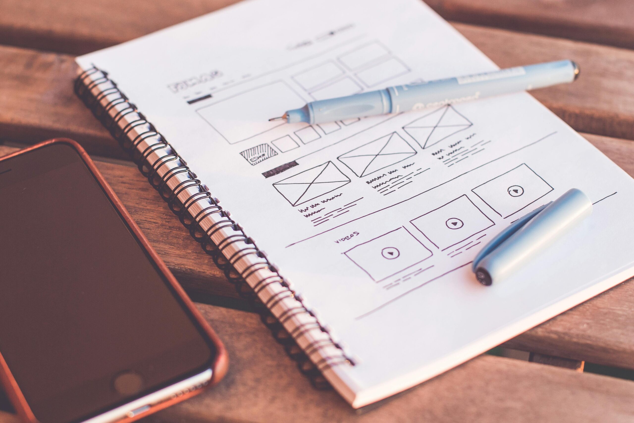
2. What Makes a Great Homepage (Hint: It’s Not Just Pretty)
This is one of my favorite things to help people with. Homepages are often overdesigned and under-thought. You don’t need to throw everything on there—just the right things.
Here’s what I now believe every good homepage needs:
- A Clear Headline – Within 3 seconds, I should know who you are, what you do, and who it’s for. No fluff. Just clarity.
- Strong Call to Action (CTA) – Want me to book a call? View your portfolio? Sign up for a service? Make it obvious and repeat it.
- Visual Hierarchy – Guide the eye. Use whitespace, contrast, and intentional layout to make it easy to scan.
- Brief About or Intro – A short section that humanizes your brand or service. Save the long story for your About page.
- Trust Elements – Testimonials, certifications, client logos—anything that builds credibility.
Bonus points for keeping it fast and mobile-friendly. More than half your traffic is likely coming from phones. Don’t make people pinch and zoom just to read.
3. Common Mistakes I’ve Made (and Seen Others Make)
No shame here—we’ve all done these. But learning to avoid them early can save you time, money, and a lot of frustration.
❌ Mistake #1: Designing for Yourself, Not Your Audience
I once built a homepage I loved—dark mode, neon buttons, animated backgrounds. It was fun… but totally missed the mark for my target clients. Design should serve the user first.
❌ Mistake #2: No Clear Navigation
I’ve landed on so many sites with confusing or cluttered menus. Keep your main nav simple—5 to 7 links max. Make the next step obvious.
❌ Mistake #3: Ignoring SEO Basics
Even simple things like page titles, meta descriptions, and using proper header tags (H1, H2, etc.) can make a big difference. I ignored this early on and wondered why no one found my site.
❌ Mistake #4: Neglecting Mobile Design
A homepage that looks great on desktop but breaks on mobile? It’s more common than you’d think. Always preview and test your site on multiple screen sizes.
❌ Mistake #5: Not Asking for Feedback
I used to tweak my homepage endlessly in isolation. Now, I send it to a few trusted people before I go live. Fresh eyes catch things you’re too close to see.
Final Thoughts
Building a website—whether it’s for your business, your blog, or your side hustle—doesn’t have to be overwhelming. But it does help to slow down and focus on the fundamentals.
Start with a solid host. Build a homepage that speaks directly to your audience. And don’t be afraid to mess up a little—that’s how we learn.
Still not sure which host to pick or how to fix your homepage? I’ve been there. Drop me a message or check out more of my blog posts for deeper dives into each of these topics.
The internet is full of noise. Your website should feel like a calm, clear, confident voice in the middle of it all.
And if I can help you get there, even just a little—well, that’s what Stillwater is all about.
Want help formatting this into a post with images or a lead magnet checklist version? Just say the word!
4o